


In honor of Geocities shutting down, I’ve compiled some highlights from my Geocities-era graphic designing days. Warning: your eyes may burn from the sheer horror of it all.

First, a button for others to link me. Wtf is up with the rainbow basket weave? As far as I remember, *starsparkle* featured no information on baskets. I also used that font, Violation, in, like, every other graphic I made.

Blinkie! Oh man, guys, blinkies were so cool, and I was so into making them. I think I even paid like $30 once for Jasc Animation Shop so I could continue with it. Nothing compares to animated gifs.

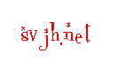
From svhsy.net. I guess I was trying to edit something out of the background (probably the book title), and I thought the black scribble in Microsoft Paint would do the trick. And that font, Sevenet 7, I think it was called, was all the rage.
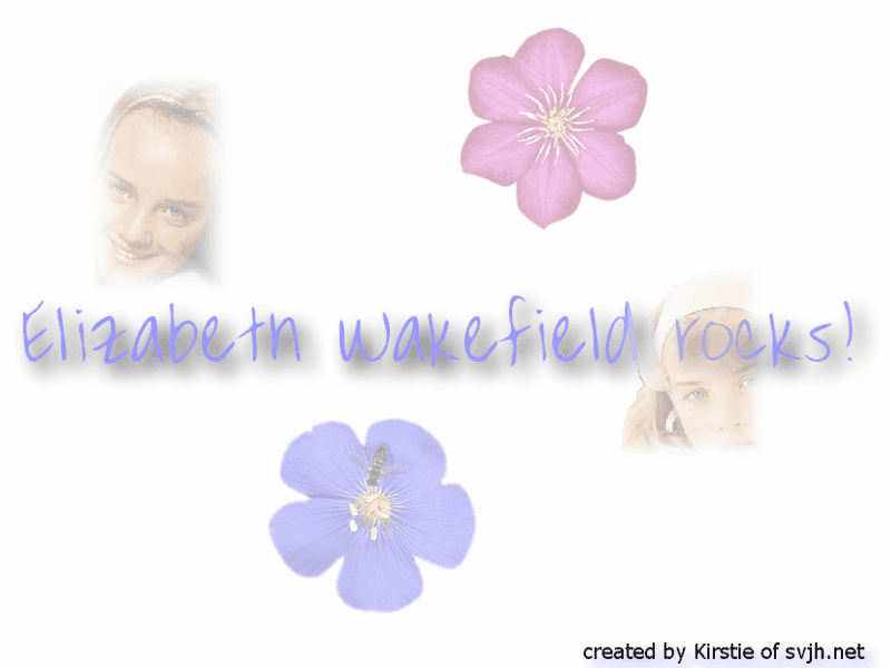
This was my definition of a downloadable wallpaper. I love the shadow effect, the blurred edges of her face, and the stock flower images. I’m considering using this as my wallpaper again. At least it’s better than the other one I had on svjh.net, which said “SVJH Rocks!” in size 72 Verdana with stock rose images that had nothing to do with anything.
Another Jasc Animation Shop gem = the star transition. So, so classy. Also classy is that font that everyone and their mom used. I think it was called Font Diner.com Sparkly or something. Wait, what? Oh, never mind. I thought that name sounded too ridiculous to be true, but that’s in fact what it was called.
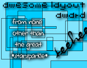
This is mostly here for me to comment on the “teehee.” So cringeworthy.

Yet another star transition! I think I had like twelve of those on every site. Also note the Sevenet 7.
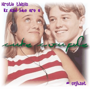
I guess there was a page where you submitted your favorite Sweet Valley Junior High pairing in exchange for a graphic. The fonts! The terrible quality! The faded edges!
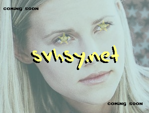
WHY are there stars in her eyes? And what’s with the terribly unsmooth text?
Wow, what a shame. And I’m sure I could find even worse examples if I looked harder.
Check out XKCD if you haven’t yet today. The site’s redesign for the day is amazing. Best thing I’ve seen all day (perhaps all week). Also, I’m very happy that “RIP Geocities” made it as a Twitter Trending Topic. It’s good to know I’m not alone in my mourning.
